
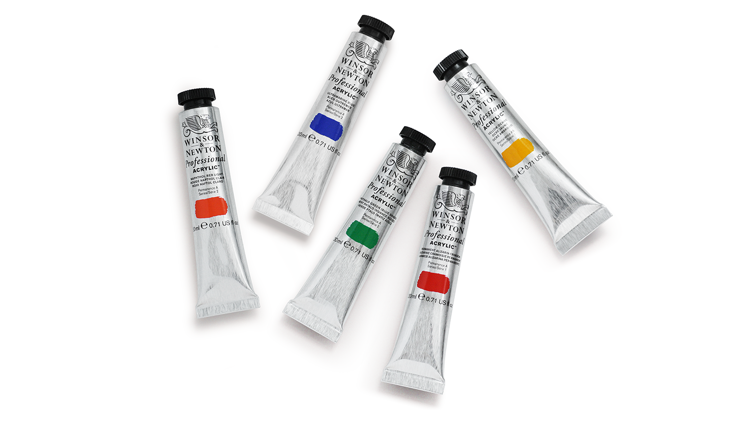
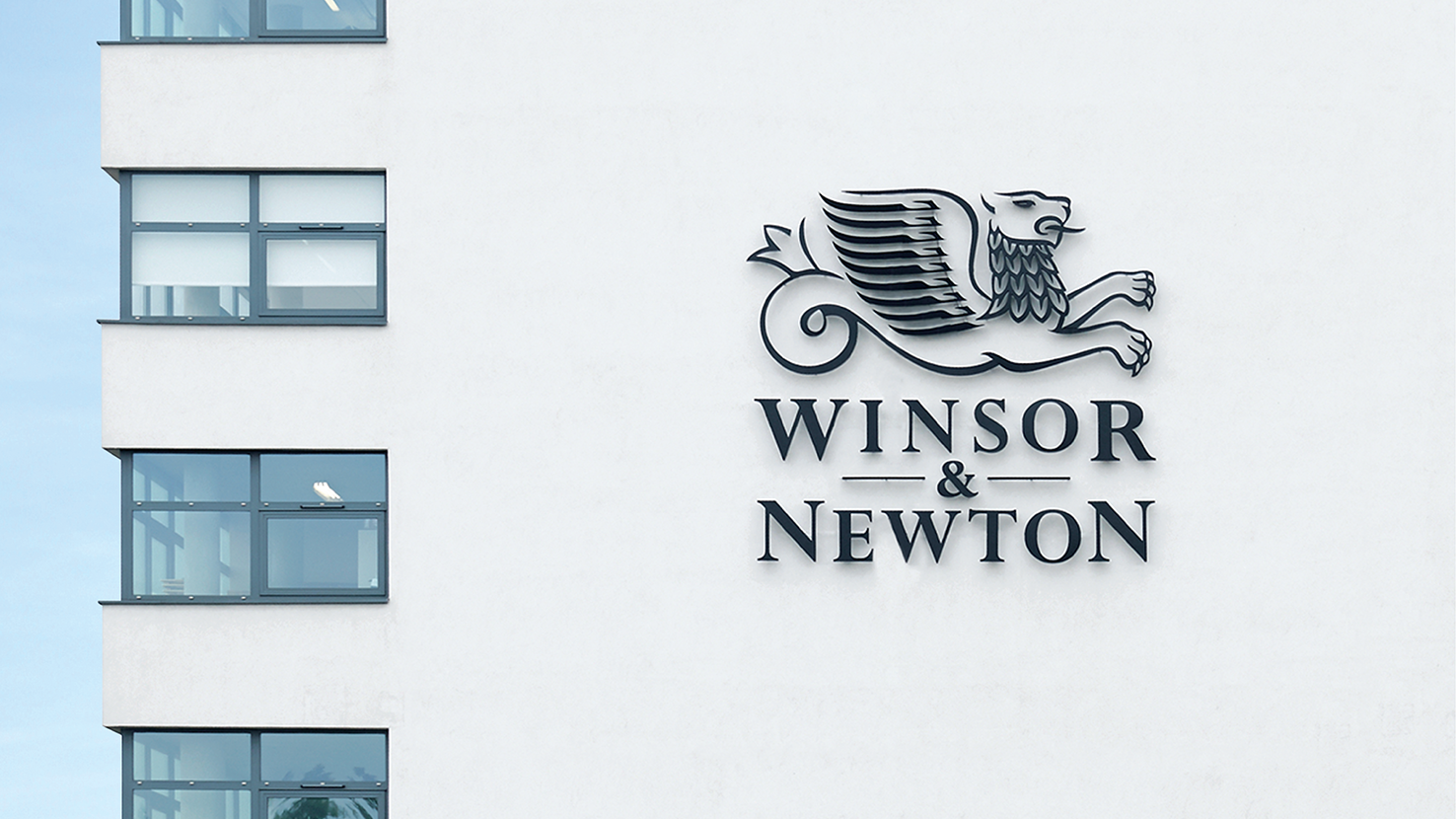
The famous art supplier wanted a refreshed identity that could be rolled out across their vast range. The original marque was lost on an information-heavy pack so the new identity heroes a redrawn and modernised griffin logo. Removing the iconic griffin from the holding device of the arch and positioning it top and central gives it more status and clarity. Silver was introduced as the key colour for packaging, which is in homage to the traditional aluminium tubes much loved and revered by artists, and to also reaffirm the quality and heritage of Winsor & Newton materials.
Winsor & Newton - Brand identity & packaging - Designed at Pearlfisher