
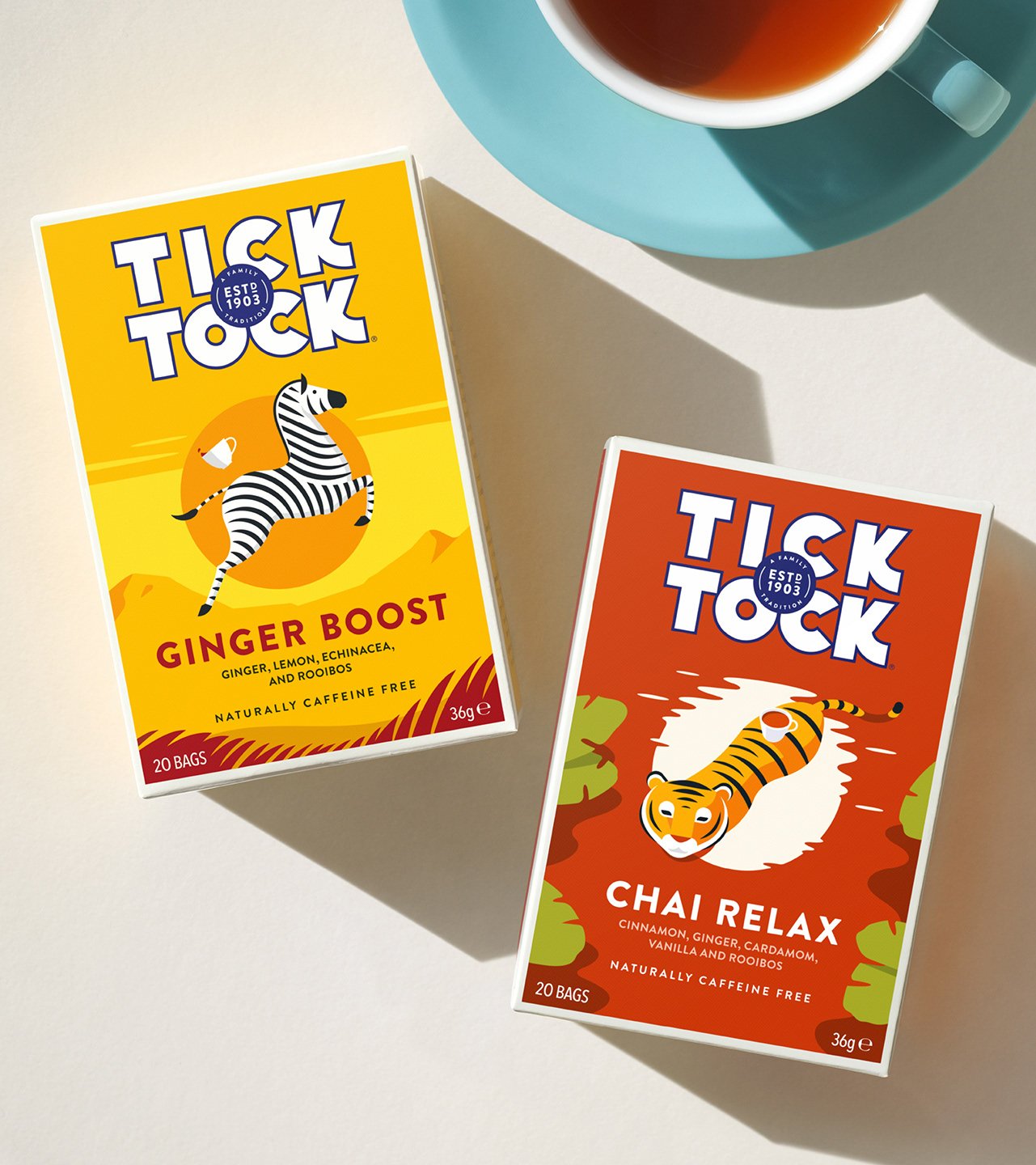
Tick Tock is one of Britain’s most iconic and best-loved tea brands. Independent and proudly pioneering, the family behind it first cultivated rooibos back in 1903, and four generations later they continue to champion this variety.
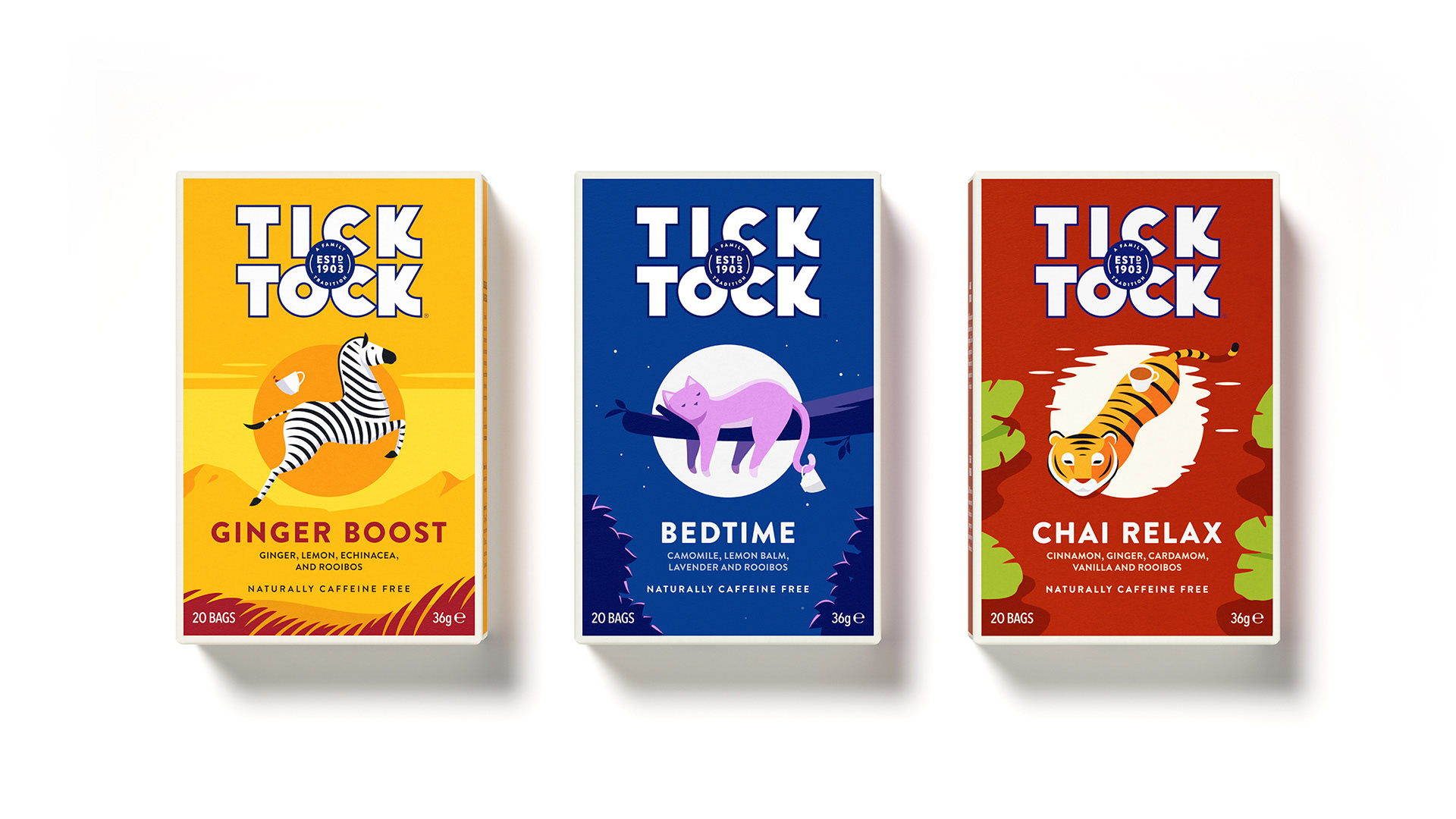
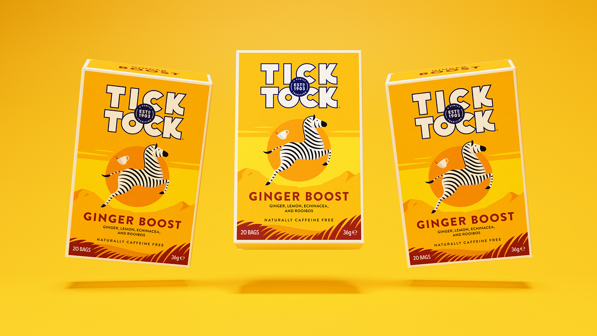
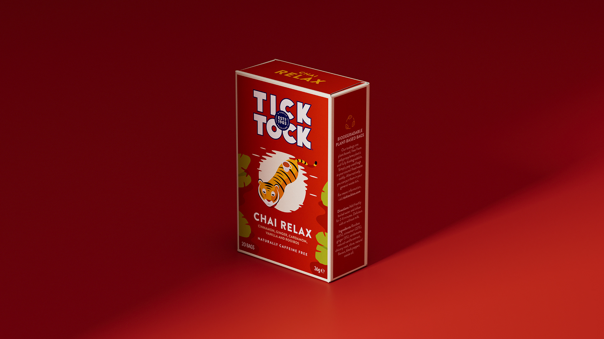
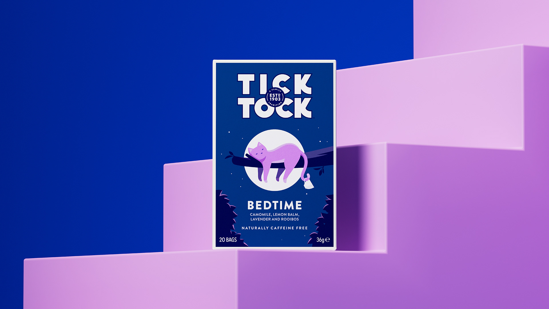
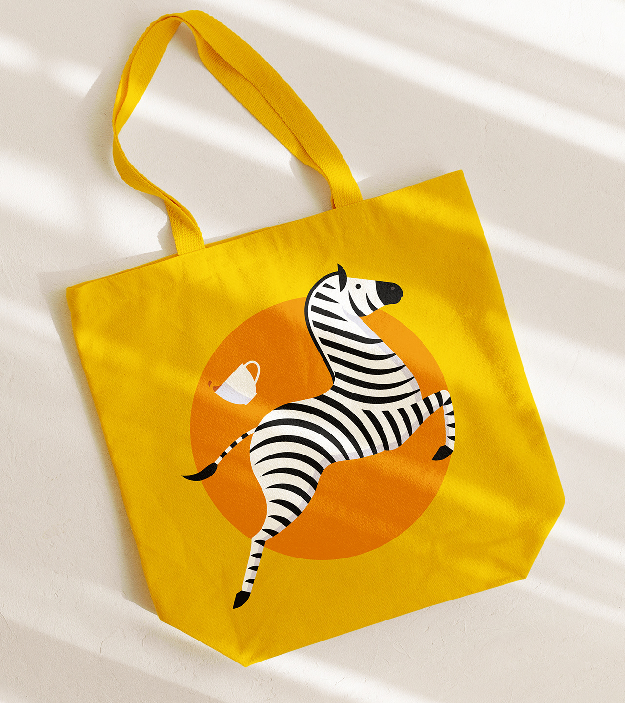
I was invited to develop Tick Tock’s Wellbeing range, three rooibos-based blends designed with both flavour and function in mind. Ginger Boost blends ginger, lemon and echinacea to support natural defences. Chai Relax combines cinnamon, cardamom and ginger for a gently spiced wind-down. And Bedtime, with camomile, lemon balm and lavender, is perfect for easing into rest.
While many brands focus solely on flavour, I wanted to capture Tick Tock’s playful personality through character-led storytelling. From a wide range of illustration sketches, we landed on three spirited mascots: a leaping zebra for the zingy lift of Ginger Boost, a tiger takes a dip in the reflection of a warm sunset for the calming spice of Chai Relax, and a dozing cat for the soothing calm of Bedtime.
These charming characters bring each blend to life across packaging, marketing and beyond, all supported by Tick Tock’s bold typography, bright colours and cheerful tone of voice. The Wellbeing range captures the essence of the brand’s motto: A tea for anytime. Morning, noon and night.
“Working with Jamie is always a real pleasure. He is an exceptional designer and illustrator with a deep understanding of brand who — critically— is able to bring his creativity and integrity to bear within the confines of a tightly managed commercial process.”
Patrick Busse, director at Tea Times Trading Ltd.
Patrick Busse, director at Tea Times Trading Ltd.
Tick Tock Wellbeing
Tick Tock, 2024
Packaging design & illustration
Art Direction: Only Now
Tick Tock, 2024
Packaging design & illustration
Art Direction: Only Now