
From tea leaf to tea cup
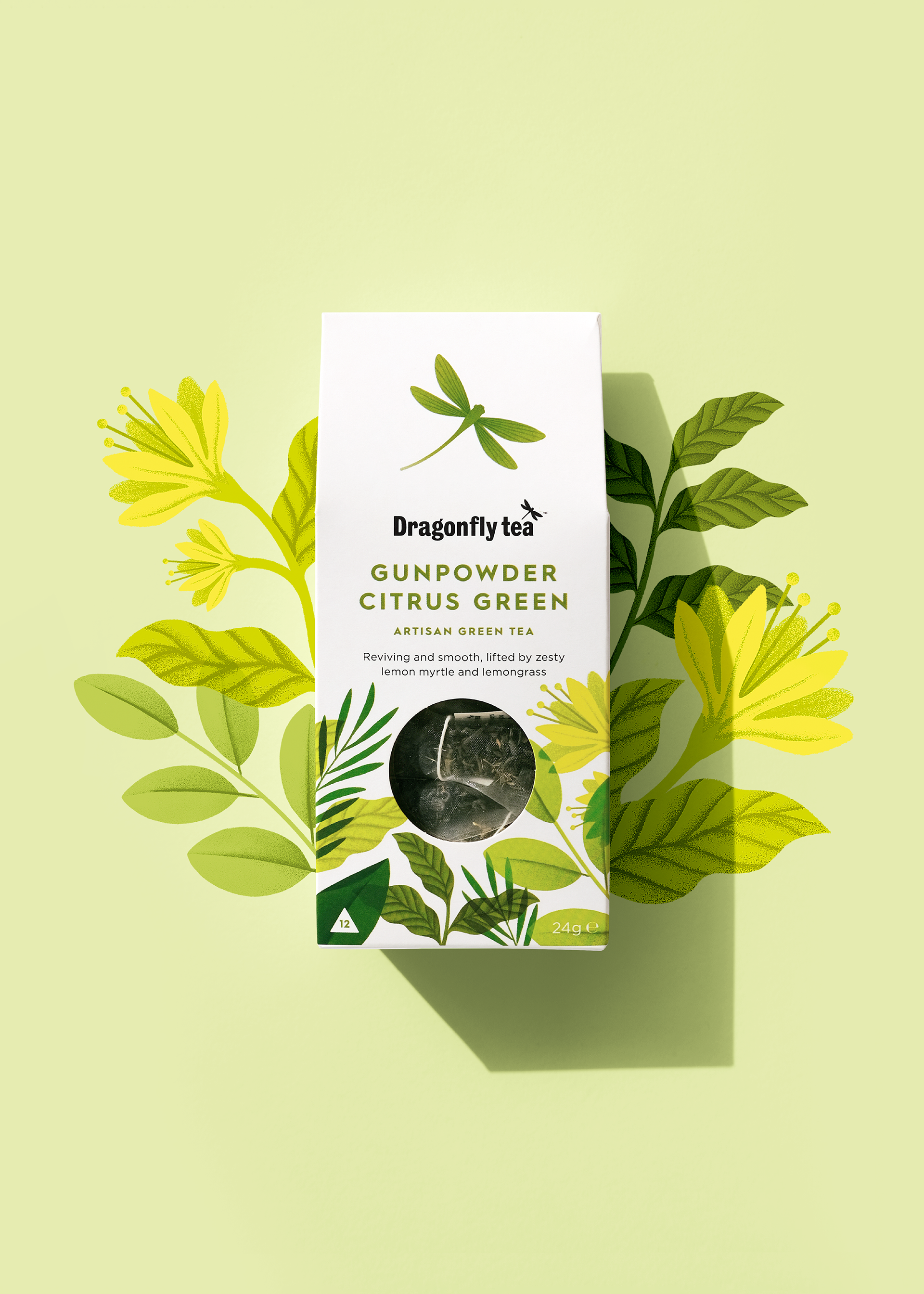
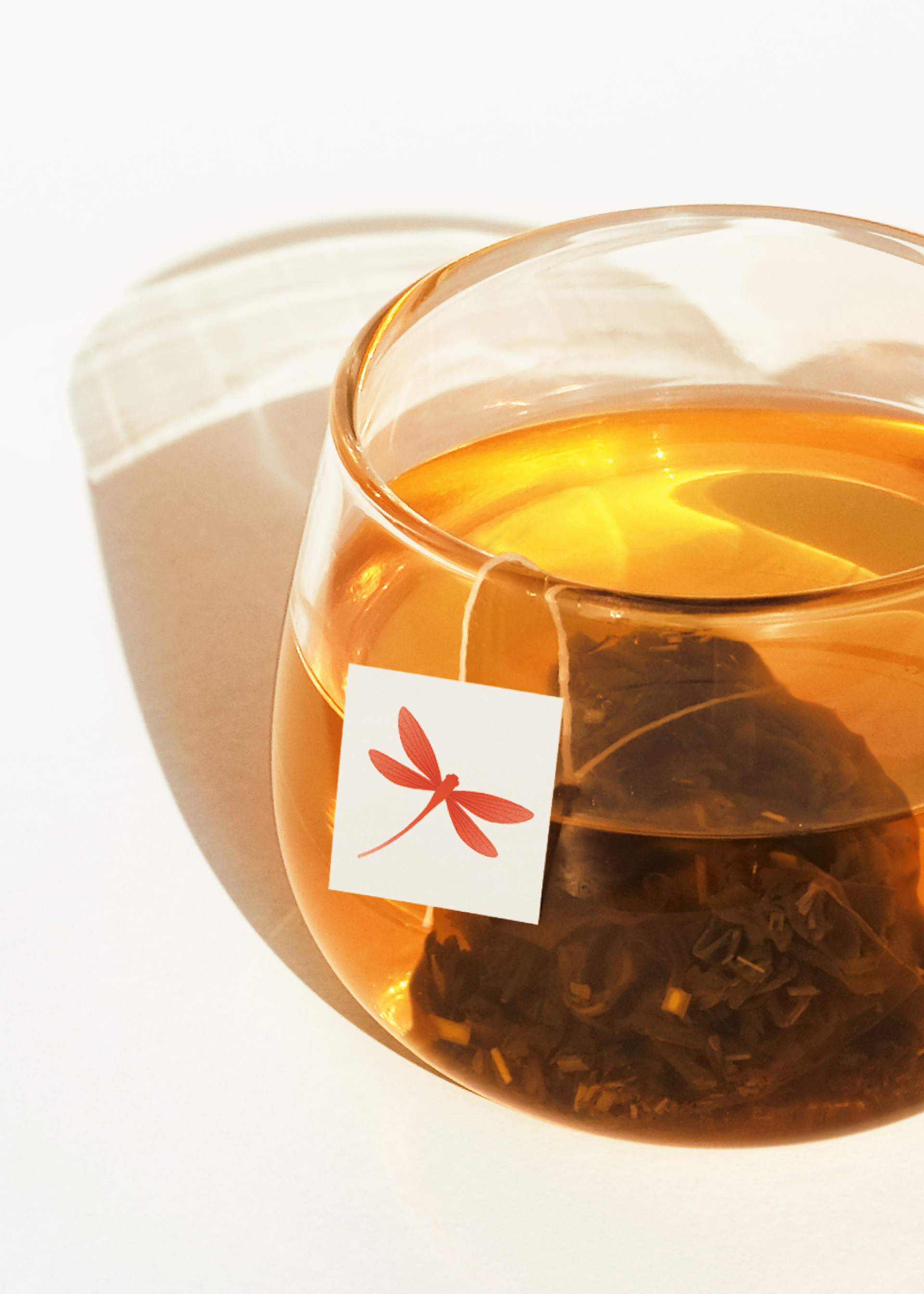
Dragonfly is an independent British family business, and for over a century has been dedicated to selecting and picking only the finest teas. This story was the inspiration behind our design, with an elevated and redrawn Dragonfly, helping consumers to navigate and discover a landscape of flavours.
Identity, packaging
DRAGONFLY TEA
Dragonfly is an independent British family business, and for over a century has been dedicated to selecting and picking only the finest teas. This story was the inspiration behind our design, with an elevated and redrawn Dragonfly, helping consumers to navigate and discover a landscape of flavours.
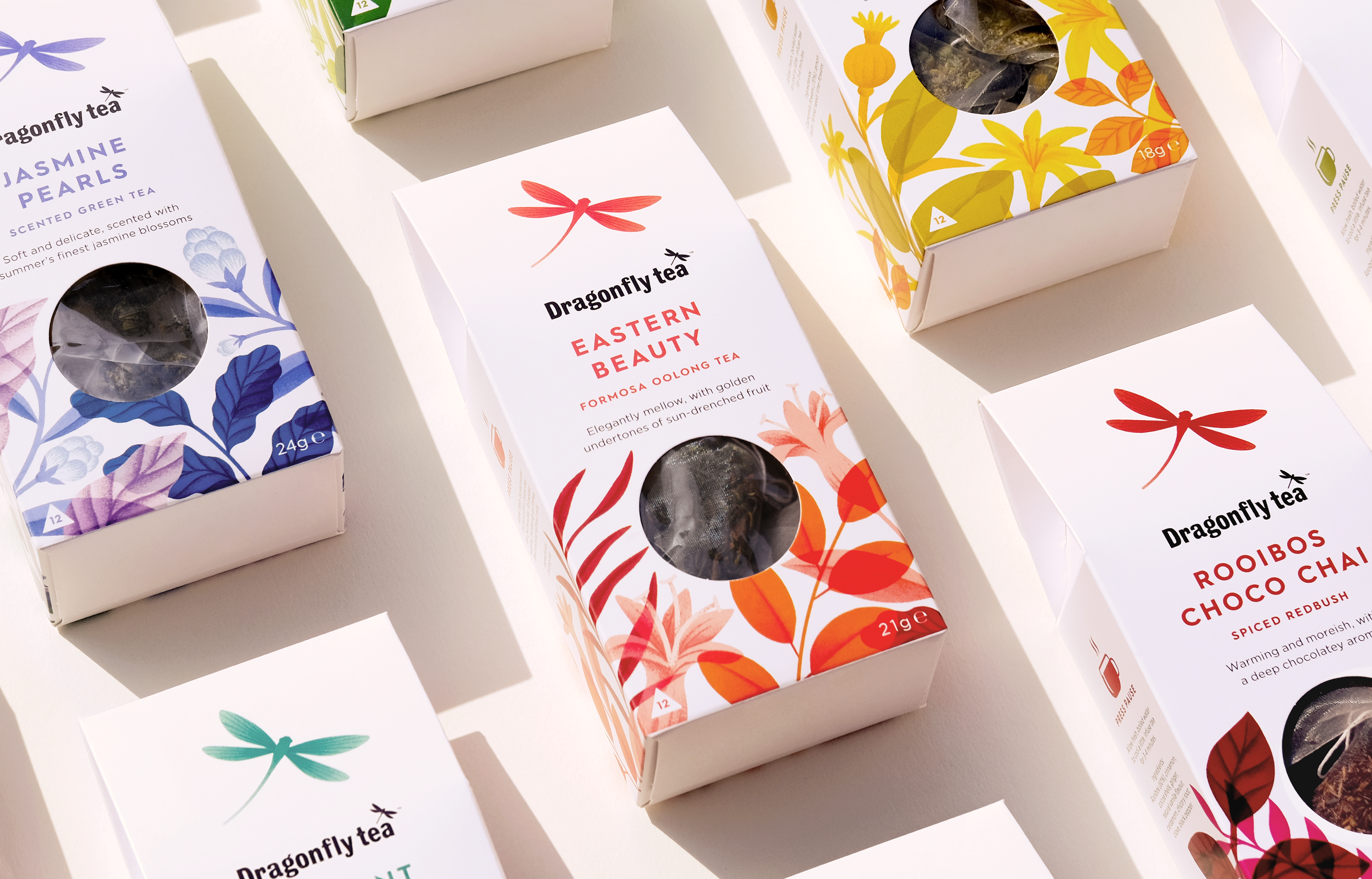
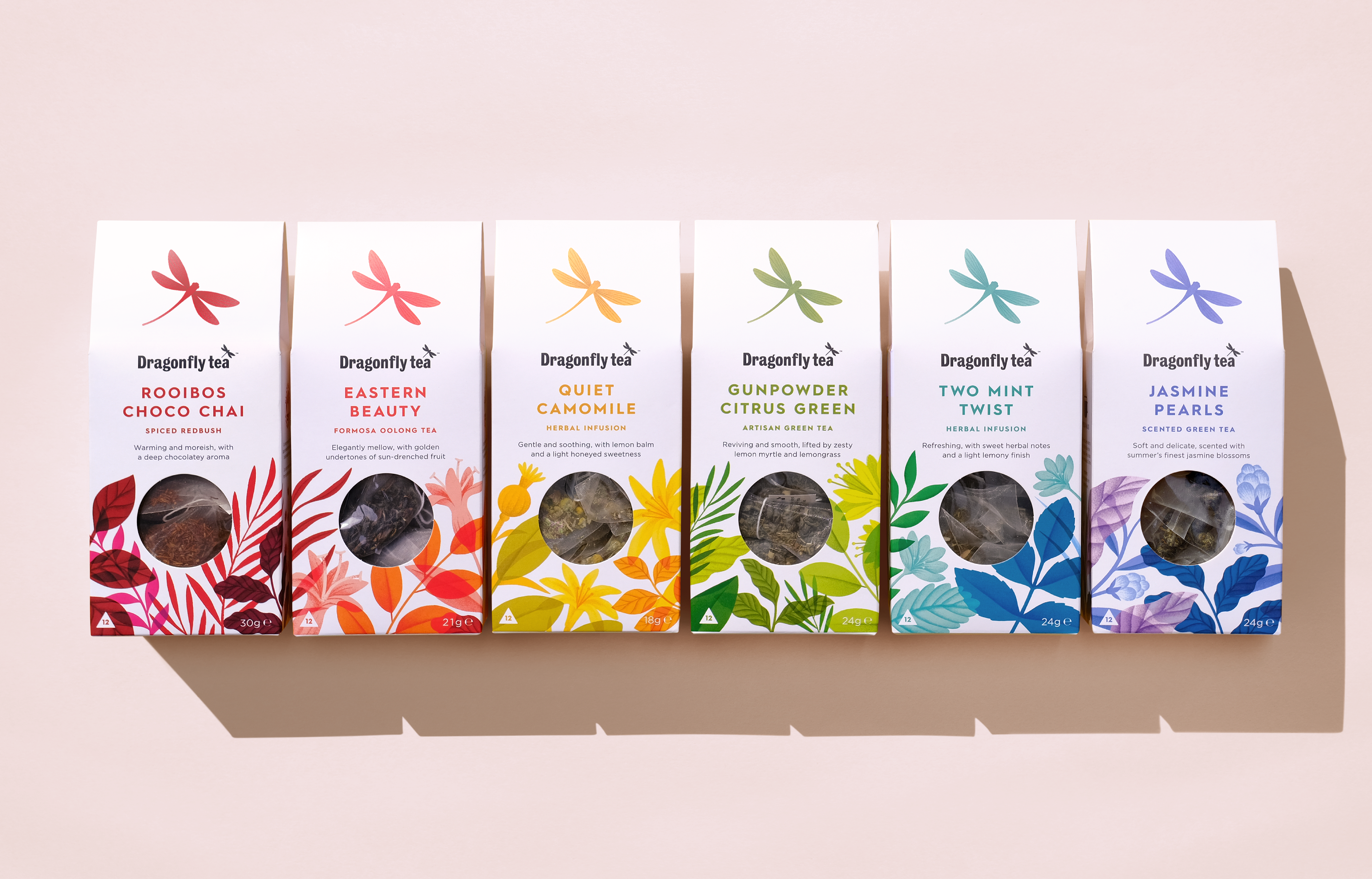
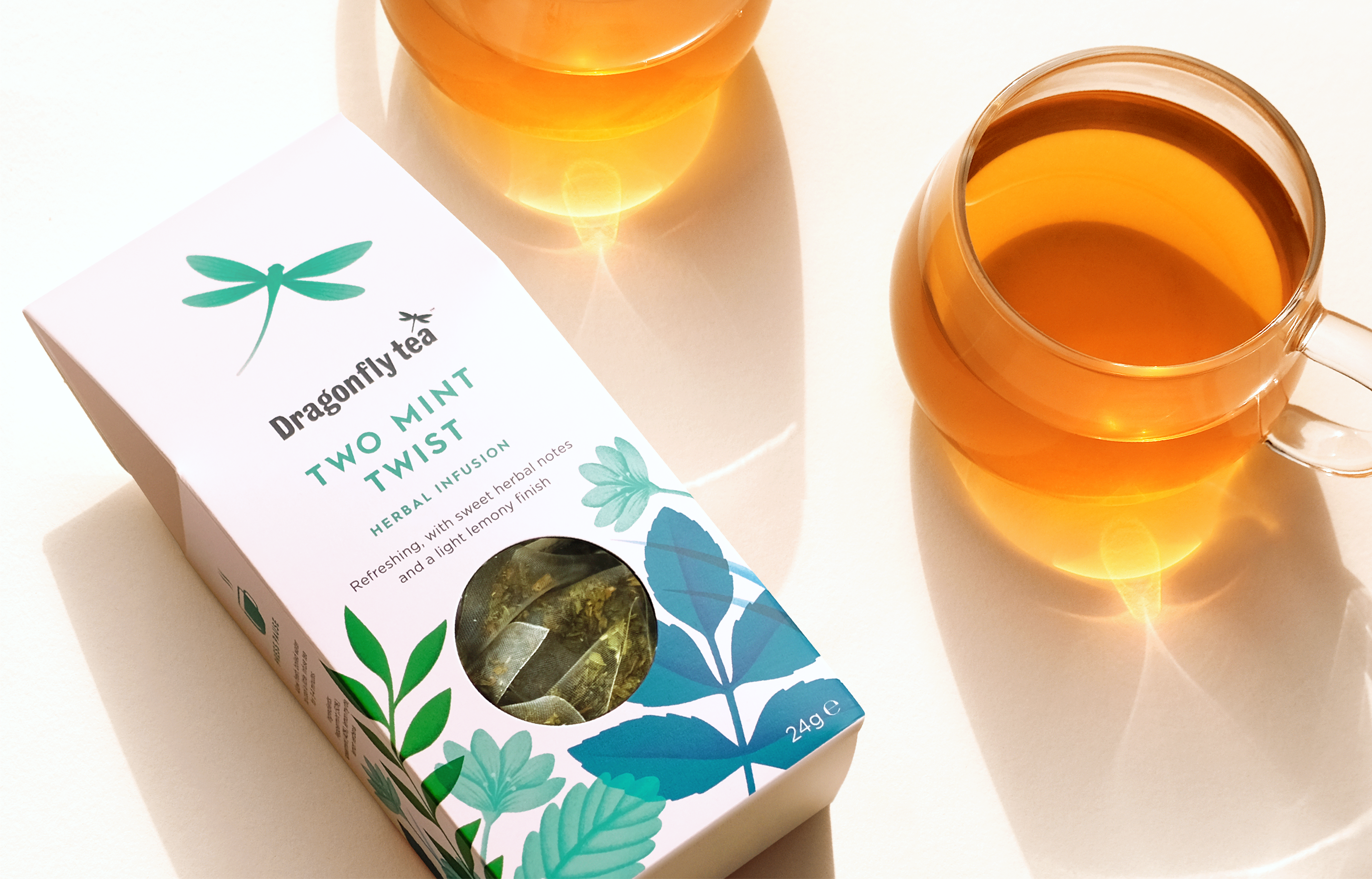
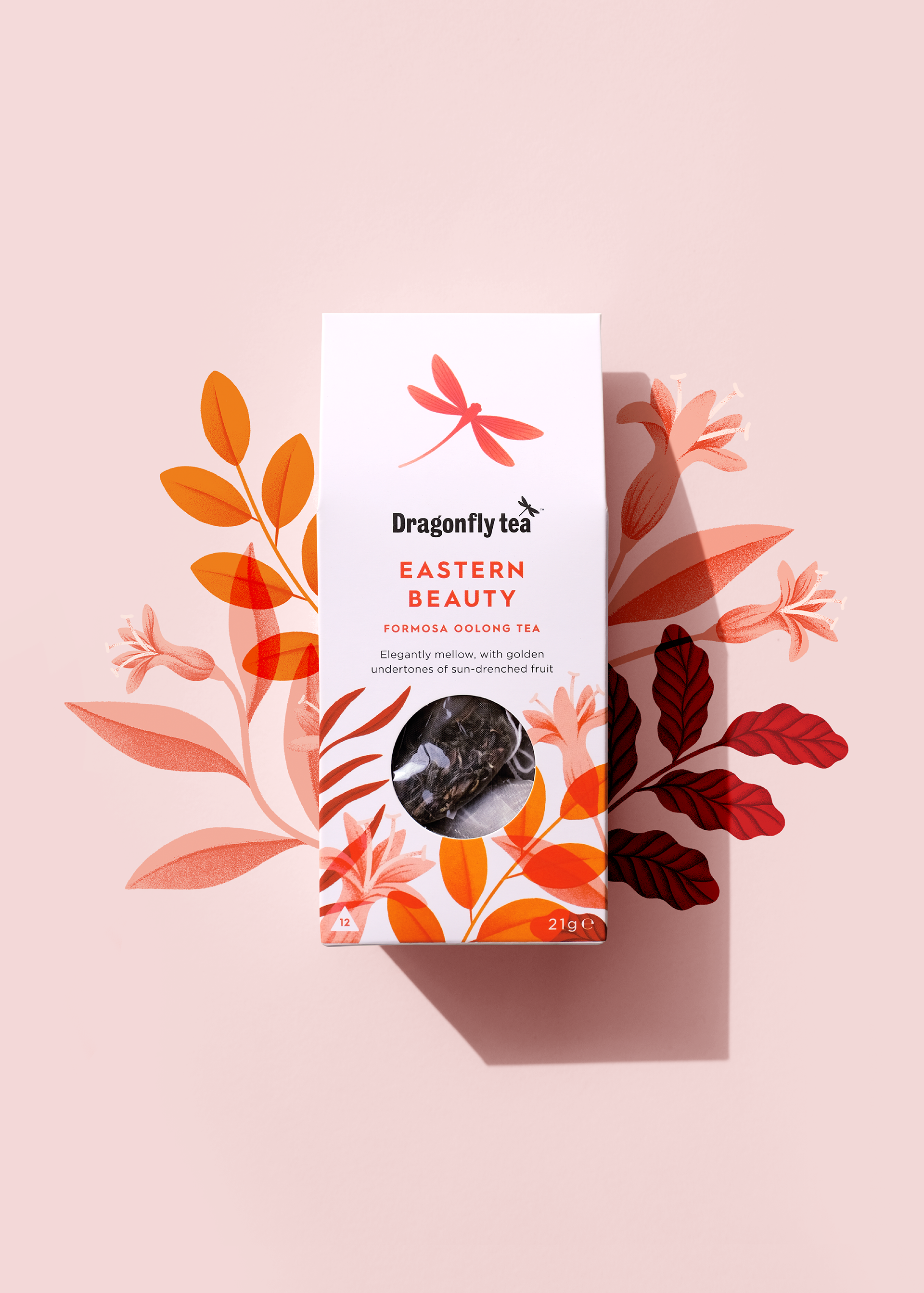
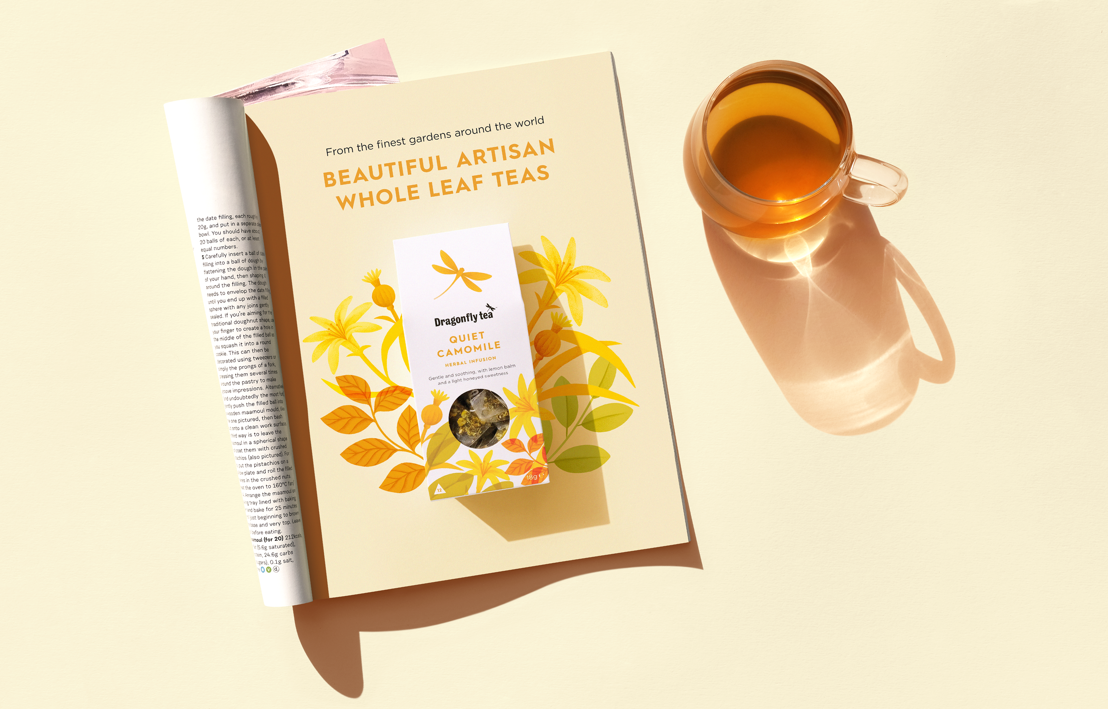
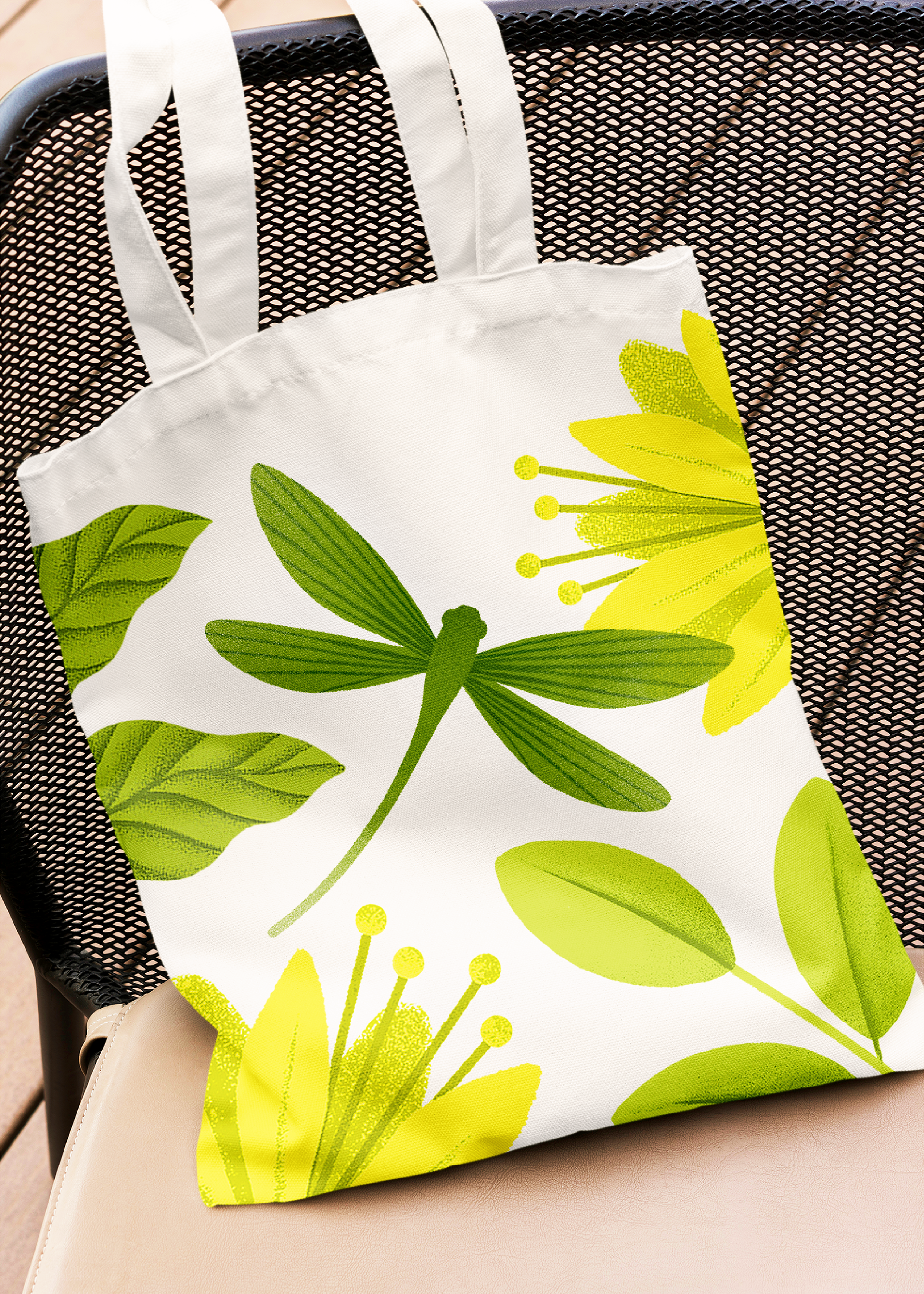
Tatiana Boyko’s original illustrations have been evolved with a bolder colour palette and layered style to capture the artisan tea blends. Each variant retains its own colour coding and distinct flower, to represent the tea type and ingredients used to make it. The illustrations are placed in a less rigid composition and grow wildly around the pack as they would in nature.
The bold and colourful design brings clarity to the range, and moves the brand on from the existing pared-back, botanical aesthetic, while the new pack format with window adds premium cues and places the product front and centre.
Nadia Morse, Marketing Director at Tea Times Trading says:
"The design challenge was to appeal to new mainstream tea drinkers with a clear and ownable message of heritage, craft and flavour. Jamie’s designs brought our tea selection to life, and by reimagining our existing botanical illustrations, he managed to create a coherent and attractive range all while giving each individual pack its own identity. We’re over the moon with the result, the designs are premium yet inviting. Jamie has a real knack for balancing creative flair with brand messaging."
Dragonfly is an independent British family business, and for over a century has been dedicated to selecting and picking only the finest teas. This story was the inspiration behind our design, with an elevated and redrawn Dragonfly, helping consumers to navigate and discover a landscape of flavours.
Tatiana Boyko’s original illustrations have been evolved with a bolder colour palette and layered style to capture the artisan tea blends. Each variant retains its own colour coding and distinct flower, to represent the tea type and ingredients used to make it. The illustrations are placed in a less rigid composition and grow wildly around the pack as they would in nature.
The bold and colourful design brings clarity to the range, and moves the brand on from the existing pared-back, botanical aesthetic, while the new pack format with window adds premium cues and places the product front and centre.
Nadia Morse, Marketing Director at Tea Times Trading says:
"The design challenge was to appeal to new mainstream tea drinkers with a clear and ownable message of heritage, craft and flavour. Jamie’s designs brought our tea selection to life, and by reimagining our existing botanical illustrations, he managed to create a coherent and attractive range all while giving each individual pack its own identity. We’re over the moon with the result, the designs are premium yet inviting. Jamie has a real knack for balancing creative flair with brand messaging."