
Burger King’s new identity gives the fast food giant a more personal appearance. All the packaging has a hand printed effect reminiscent of the marks on the burgers that embodies Burger King’s philosophy of ‘flame grilling imperfect perfection’.
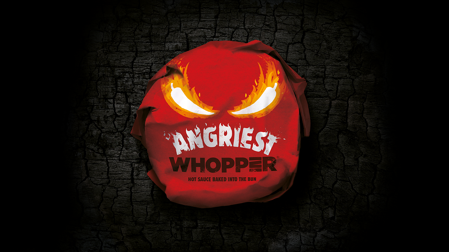
The spicy Jalapeño gives this special edition Whopper its angry attitude; the shape of the chilli doubles up as angry, fiery eyes. The packaging communicates the hot, spicy flavour and the fun idea of an Angry whopper.
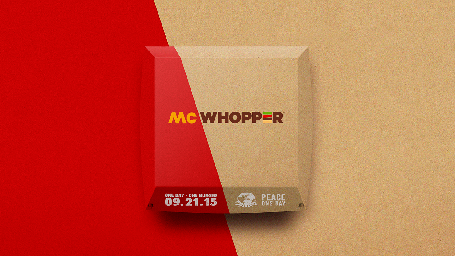
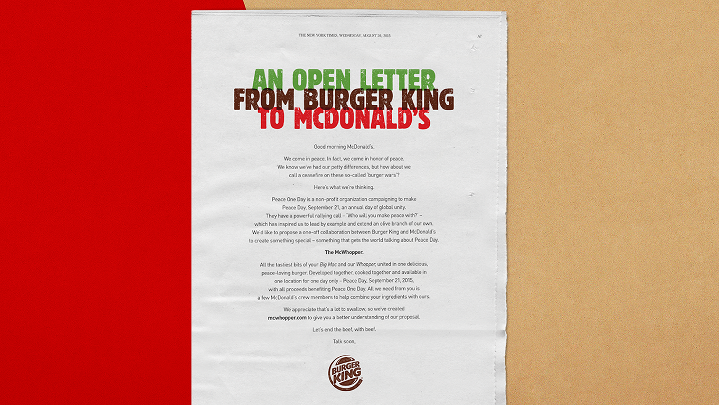
To raise awareness of Peace One Day, Burger King called for a ‘Burger Wars‘ ceasefire with rival McDonald’s, proposing to serve the McWhopper - a symbolic hybrid burger. Knowing McDonald’s might reject or ignore the proposal, the campaign strategy was to ensure the McWhopper brand flourished in PR and social media. The ‘McWhopper’ identity was developed using the two iconic brand logos and colourways crashed together to create a symbolic tension. An extensive suite of iconic assets such as a wrap, limited edition clamshell pack, staff apparel, signage, and a pop-up restaurant were also developed.
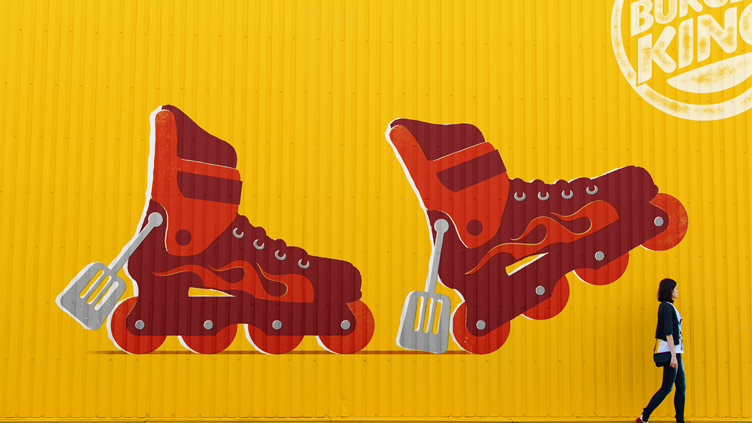
This colourful mural was created for a Miami restaurant and takes on the Burger King visual style with a Miami twist.
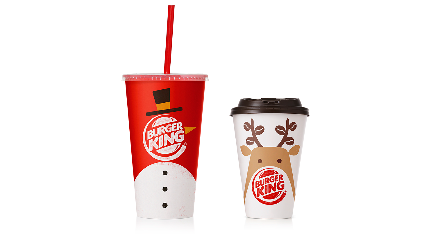
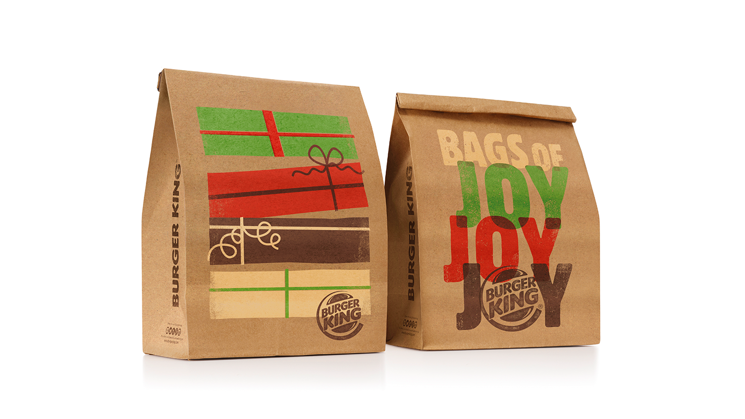
The holiday period was an opportunity to have fun with Burger King’s core assets, incorporating festive characters and imagery into their iconic four colour stripes and food graphics.
Burger King - Packaging & illustration - Designed at Turner Duckworth